
MyLO - My Learning Online
New Instructor Dashboard in Echo360
The Instructor Dashboard within Echo360 has been updated. These changes will make the dashboard more understandable and valuable, improve the accuracy of the data represented, and offer more comprehensive data exports.
What is changing?
There will be changes to the graph on the Classes tab, the columns displayed on the Students tab, and Echo are adding new metrics to the CSV exports. Additionally, you may notice a slight change in engagement metric numbers after this update since it is built upon a new, more accurate reporting framework.
Changes to Classes graph
The existing line graph will be replaced with a new stacked bar chart that better represents the activity in each class without having to select individual classes to view them. The new chart also eliminates the problem of changing the axis labels based on which metric is selected. Instructors can now hover their curser over the bars to see activity counts or they can reference that same information in the table below the graph. The activity data can be easily exported via the Export button above the table.
The new Classes graph will look similar to the mockup below.
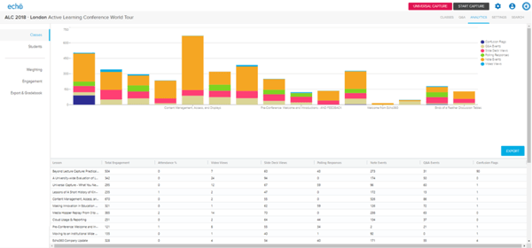
Additionally, the metric, “Total Engagement” has been added, which represents the aggregate count of all engagement activities. The previous, “Engagement” metric still represents the weightings set by the sliders on the Weightings tab. The following new metrics will be added to CSV exports, but are not visible in the graph:
- Video viewed %
- Slide viewed %
- Poll question count
- Poll response correct count
- Poll response incorrect count
- Polling participation %
- Polling correct %
The Video Engagement graph has been removed and will be replaced by a heat map overlay option in the player in an upcoming release.
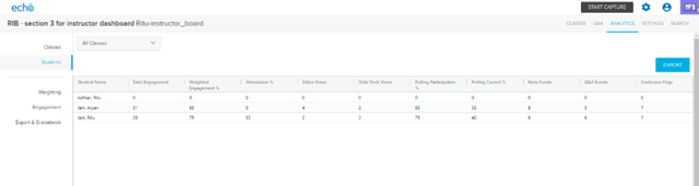
Changes to the Students tab
The “Total Engagement” column has been added to match the graph described above, but the more impactful change is to align the tables so that instructors see the same columns whether they have selected “All Classes” or an individual class.
See below for an example of the new alignment.
All Classes selected
Individual Class selected
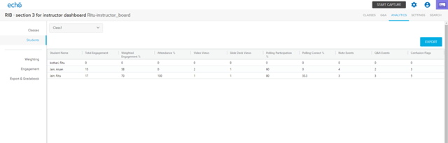
The same, “Total Engagement” metric and other new metrics are also available in CSV exports via this view.
Why is this feature changing?
These changes are intended to make the data represented in the Instructor Dashboard more useable and available and to provide more robust data exports for use in external systems.
These changes are part of a larger data initiative in the Echo360 platform that will empower instructors with more metrics at the section, class, and asset level.
How does this affect users?
These changes should be positive and make data more available with less searching, but instructors who use the video graph will need to wait for the new heat map overlay to see that information. Our usage data indicate that a very small percentage of users visit this graph in its current state.